
Build a KPI Success Ratio Dashboard Chart
For the complete documentation index, see llms.txt. For a full content snapshot, see llms-full.txt. Append.mdto anykestra.io/docs/*URL for plain Markdown.
Build a KPI chart that displays the percentage of successful executions using Kestra’s No Code dashboard editor.
Prerequisites
- A Kestra instance with at least one completed execution.
- Access to the Dashboards section in the UI.
Steps
1. Open the dashboard editor
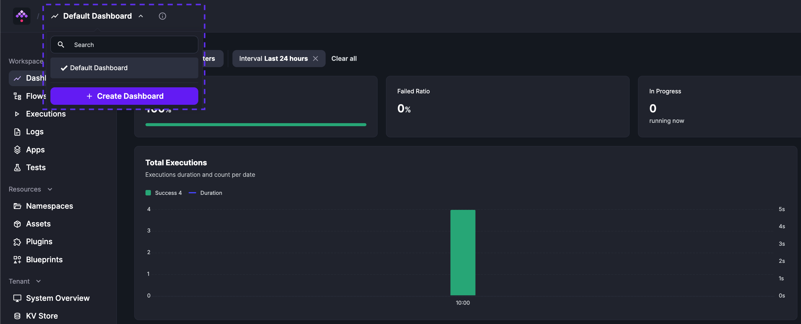
From Dashboards, select Default Dashboard and click + Create Dashboard.
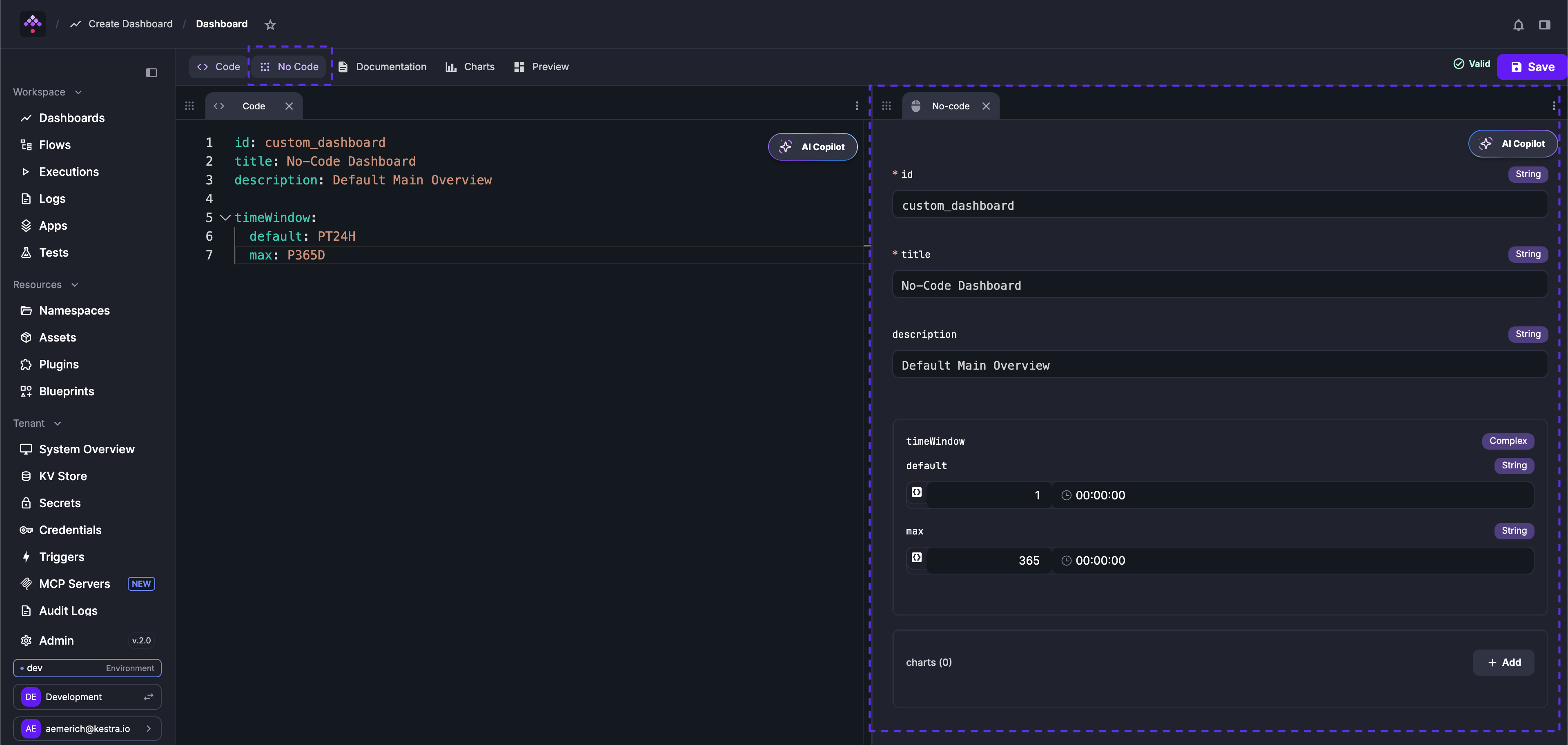
In the editor, select the No Code tab. It appears alongside the YAML editor so you can view both as you work.
2. Set the dashboard properties
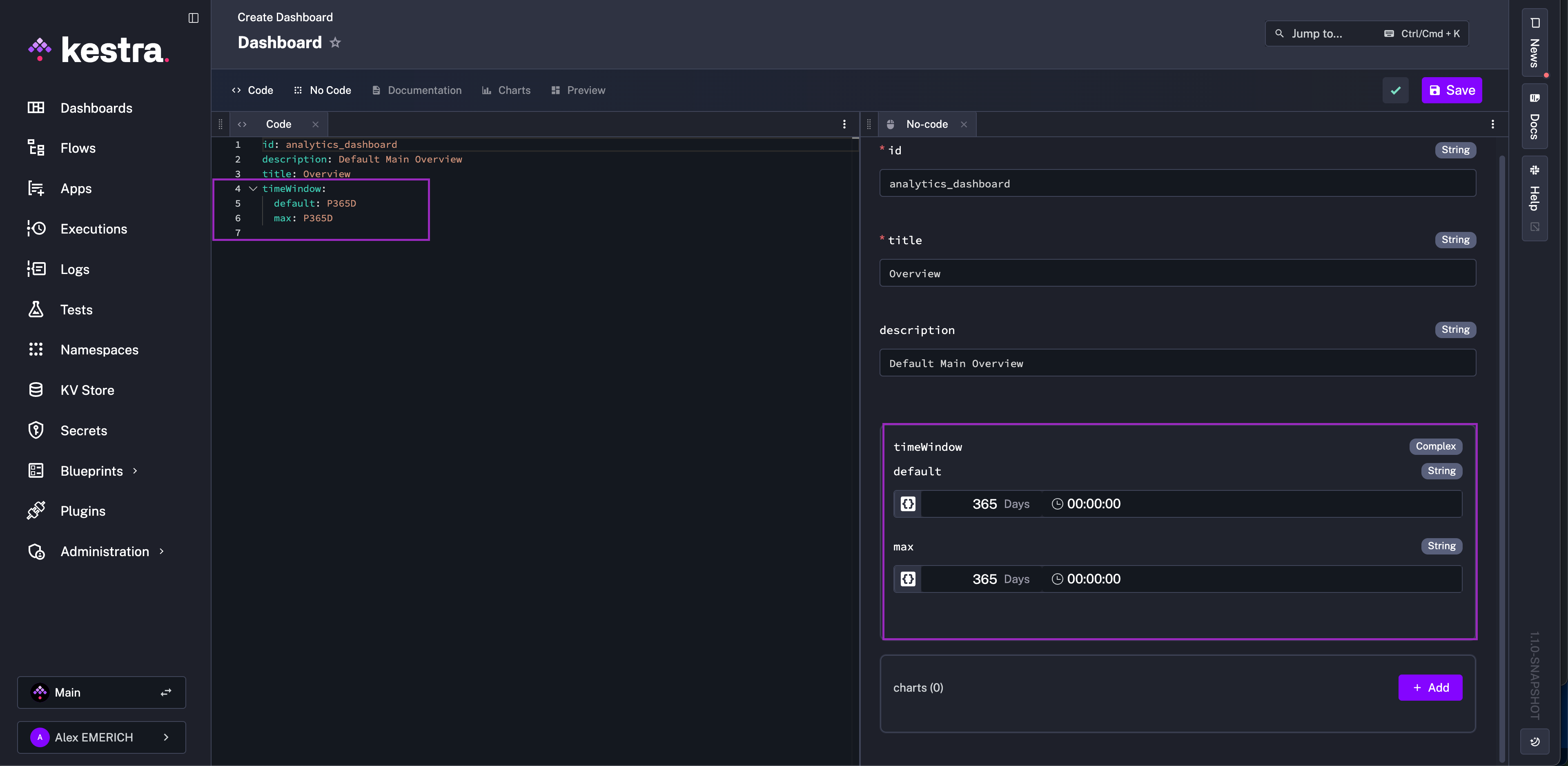
Give your dashboard an ID, title, description, and time window. Changes in the No Code form immediately reflect in the YAML editor.
3. Add a KPI chart
Click + Add in the charts block. Choose KPI Chart as the chart type. Open the Documentation tab at any time to view chart-specific guidance without leaving the editor.
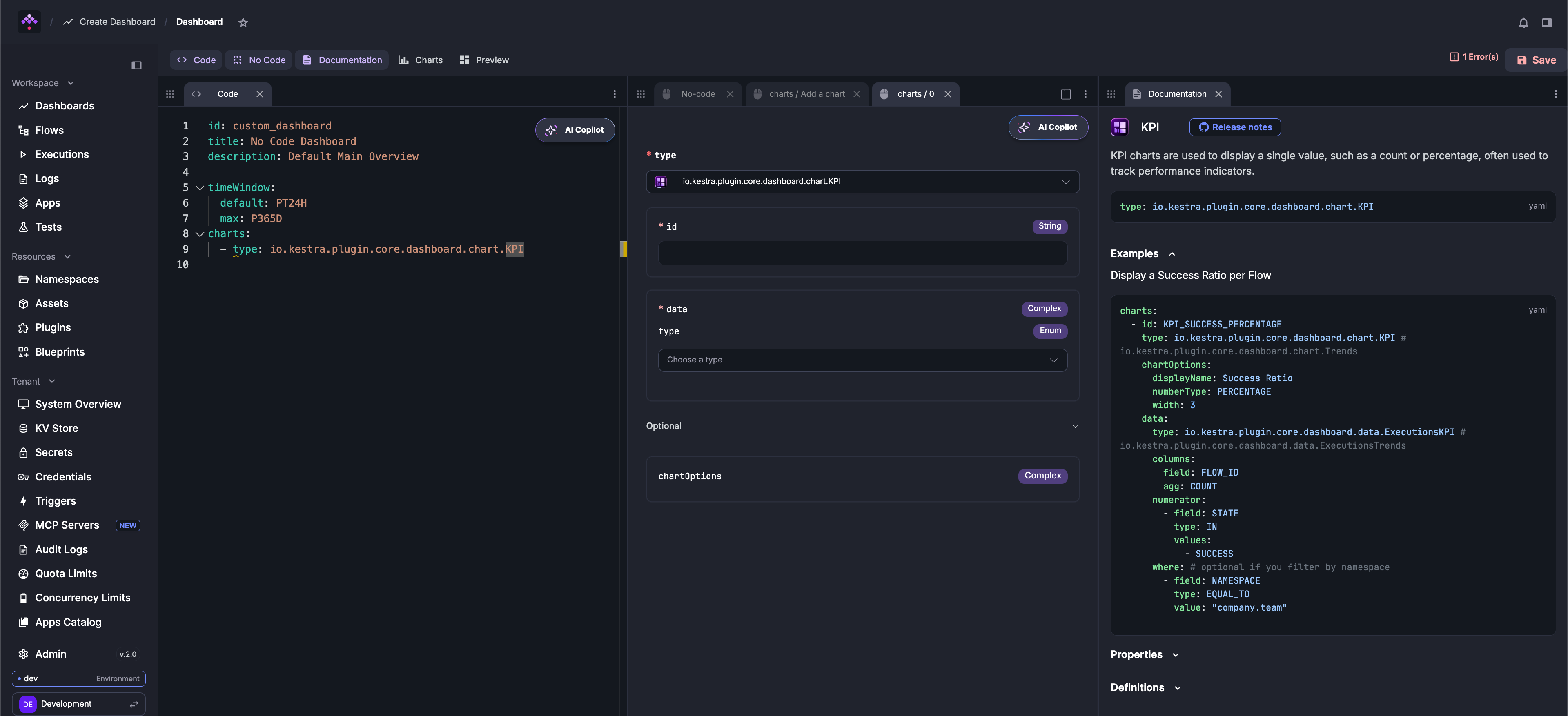
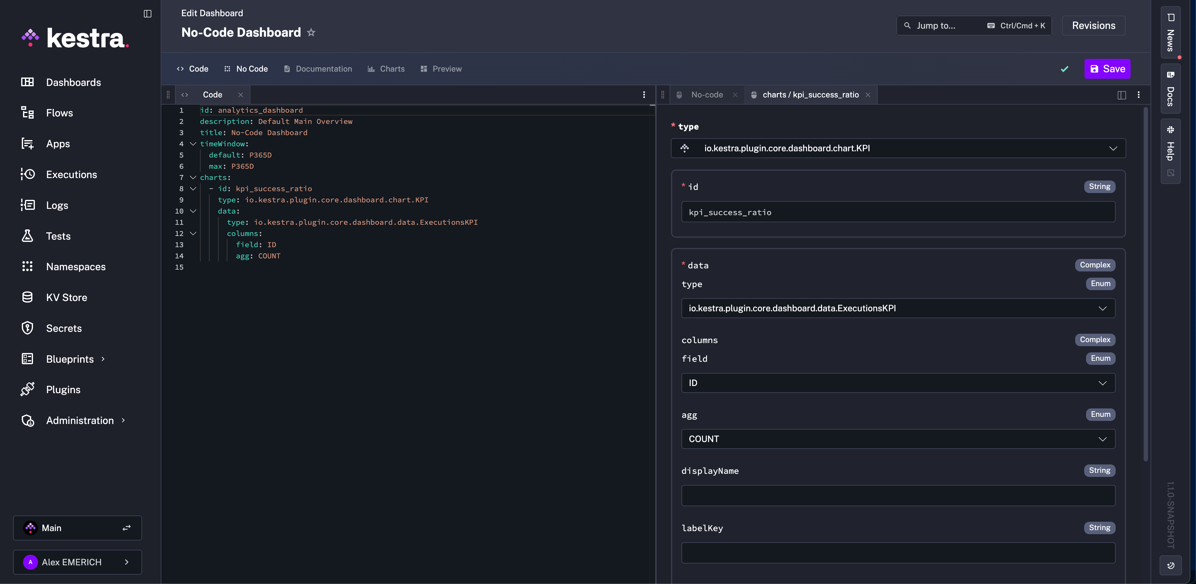
Give the chart an ID and set the data type to Executions. Set field to ID and agg to COUNT to count all executions.
4. Add a numerator filter
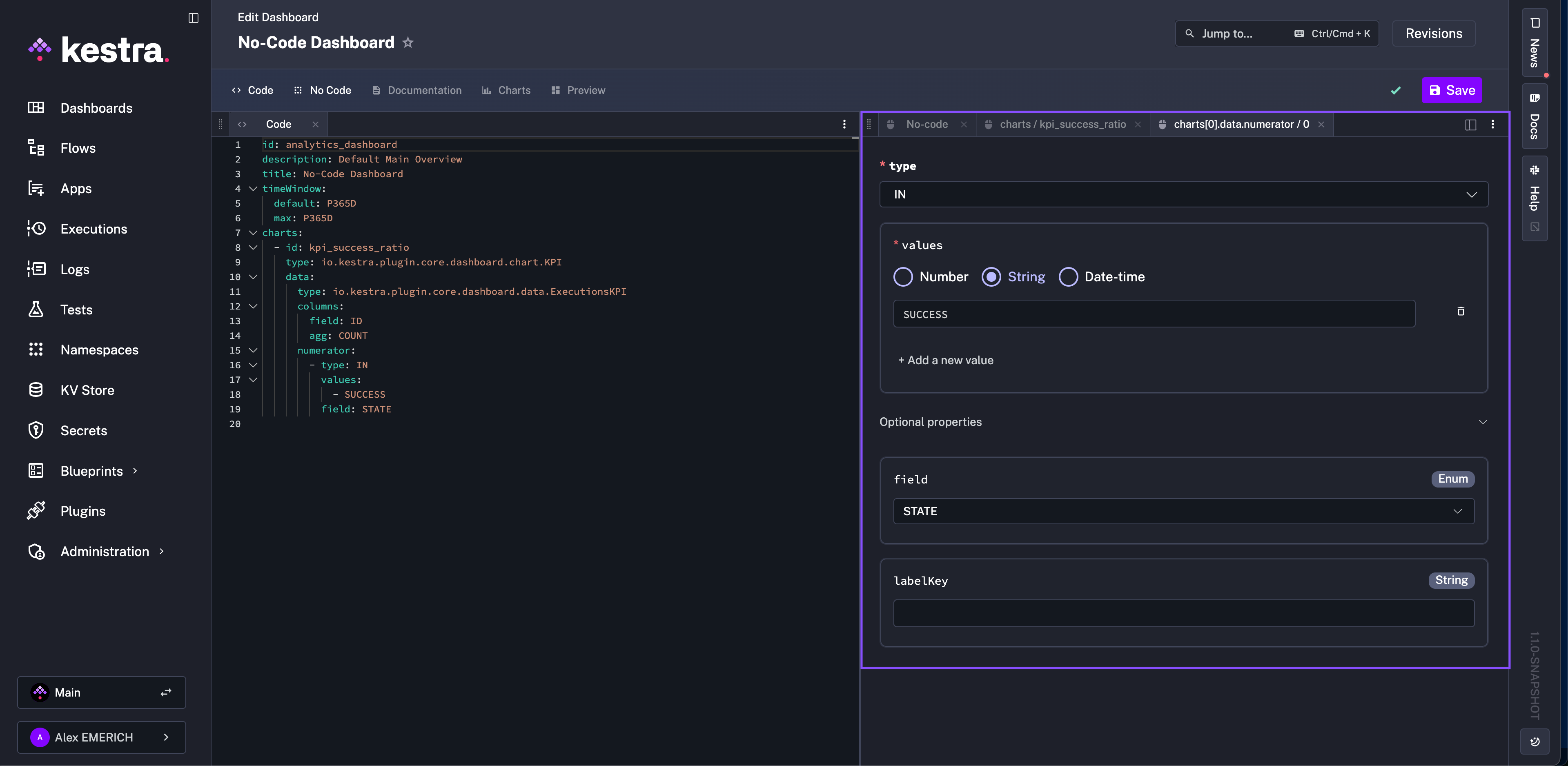
Click + Add under the numerator section. Set type to IN, add SUCCESS as a value, and set field to STATE. This scopes the numerator to successful executions — the denominator remains all executions.
5. Set display options
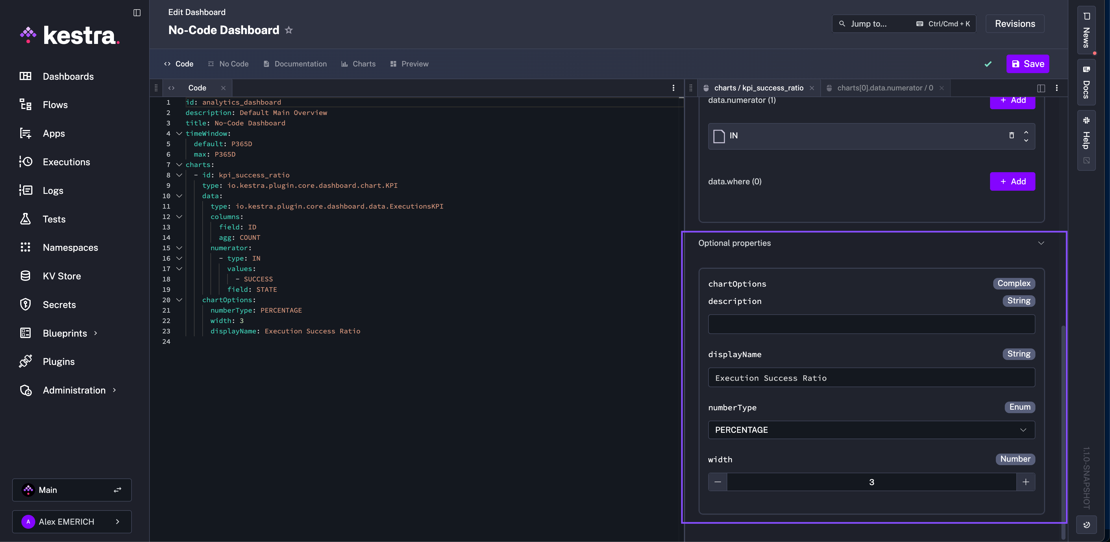
Return to the charts No Code tab and open Optional Properties. Set displayName, change numberType to PERCENTAGE, and set width to 3.
6. Preview and save
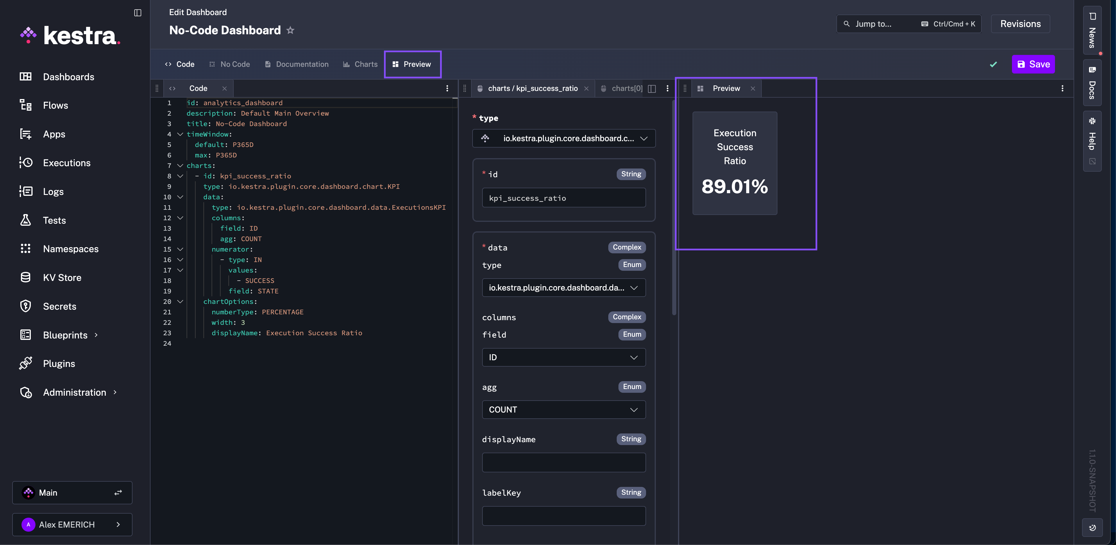
Open the Preview tab to review the chart. Click Save when satisfied.
Extend: add a failure ratio chart
To add a failure ratio chart alongside the success ratio, copy the generated YAML for the KPI chart, paste it into the YAML editor as a second chart entry, and replace SUCCESS with FAILED. The two charts will sit side by side on the dashboard.
Best practices
Organize by purpose. Group related charts into dashboards with a clear goal — for example, separate dashboards for system health, execution performance, and user activity.
Use consistent naming. A pattern like team_metric_type (e.g., dataops_executions_latency) makes dashboards easier to find, version, and export.
Use YAML for reuse. When charts share the same structure with small differences in filters or fields, copy-paste the YAML and modify — faster than rebuilding forms.
Preview before saving. Catch mismatched fields and aggregation errors early before they make it into a published dashboard.
Next steps
See the Dashboards reference for the full list of chart types, data source fields, and filter options.
Was this page helpful?