
Monitor Workflows with Kestra Dashboards
For the complete documentation index, see llms.txt. For a full content snapshot, see llms-full.txt. Append.mdto anykestra.io/docs/*URL for plain Markdown.
The Dashboards page displays the default dashboard and any custom dashboards you’ve created. Switch between them using the hamburger menu — if you have more than 10, use the search bar. The same menu lets you edit or delete dashboards. From any dashboard you can apply and save filters, refresh data, and set an automatic periodic refresh.
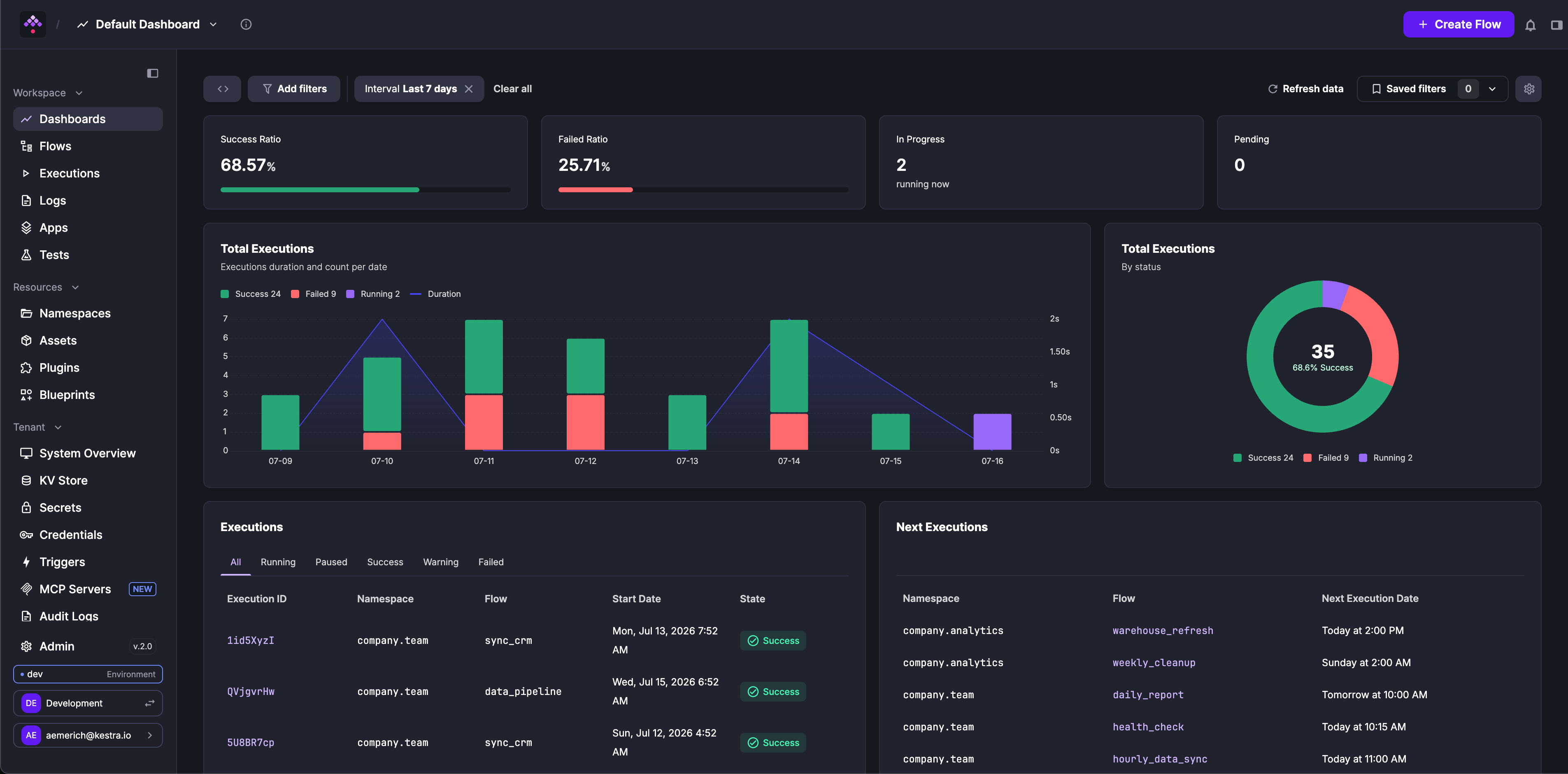
Custom dashboards
Custom dashboards let you define queries and charts to visualize execution, log, and metric data. Edit each chart individually using the pencil icon in the dashboard view.
Build dashboards using the No Code editor (no YAML required) or by writing YAML directly. Both produce the same schema-validated output.
No Code editor
The No Code editor lets you design dashboards using structured forms. As you configure charts and data sources, YAML is generated in real time and the live preview stays in sync. Switch to YAML at any point for filters, dynamic queries, or advanced layout logic — both views reflect the same underlying definition.
Interactive demo
For a step-by-step walkthrough of building your first KPI chart using the No Code editor, see Build a KPI success ratio chart.
Chart types
Dashboards support six chart types: Bar, Pie, TimeSeries, Table, KPI, and Markdown. Each data chart type is composed of chartOptions and data.
A chart’s chartOptions property controls display names, descriptions, legends, and tooltips. The data property specifies the data source, which columns to display (including aggregations and sort order), and any filters to apply.
Each chart’s options are listed in the Chart Plugin Documentation where you can dive further into the properties of each type.
Common chart properties
All chart types share the following chartOptions properties:
| Property | Required | Default | Description |
|---|---|---|---|
displayName | Yes | — | The title displayed on the chart |
description | No | — | An optional subtitle or description |
width | No | 6 | Width of the chart on a 12-column grid (1–12) |
Bar chart
type: io.kestra.plugin.core.dashboard.chart.Bar
Compares categorical data across groups. Requires exactly one aggregation column.
Additional chartOptions properties:
| Property | Required | Default | Description |
|---|---|---|---|
column | Yes | — | The data column to use as the x-axis categories |
legend.enabled | No | true | Show or hide the legend |
tooltip | No | ALL | Tooltip display behavior: NONE, ALL, or SINGLE |
charts: - id: executions_per_namespace_bars type: io.kestra.plugin.core.dashboard.chart.Bar chartOptions: displayName: Executions per Namespace description: Execution count per namespace column: namespace legend: enabled: true data: type: io.kestra.plugin.core.dashboard.data.Executions columns: namespace: field: NAMESPACE state: field: STATE total: displayName: Executions agg: COUNTPie chart
type: io.kestra.plugin.core.dashboard.chart.Pie
Shows proportions and distributions. Requires exactly one aggregation column.
Additional chartOptions properties:
| Property | Required | Default | Description |
|---|---|---|---|
graphStyle | No | DONUT | Chart style: PIE or DONUT |
colorByColumn | No | — | The column whose values determine segment colors |
legend.enabled | No | true | Show or hide the legend |
tooltip | No | ALL | Tooltip display behavior: NONE, ALL, or SINGLE |
charts: - id: executions_pie type: io.kestra.plugin.core.dashboard.chart.Pie chartOptions: displayName: Total Executions description: Total executions per state graphStyle: DONUT colorByColumn: state legend: enabled: true data: type: io.kestra.plugin.core.dashboard.data.Executions columns: state: field: STATE total: agg: COUNTTimeSeries chart
type: io.kestra.plugin.core.dashboard.chart.TimeSeries
Tracks trends over time. Requires between one and two aggregation columns.
Additional chartOptions properties:
| Property | Required | Default | Description |
|---|---|---|---|
column | Yes | — | The data column to use as the time (x) axis |
colorByColumn | No | — | The column whose values determine series colors |
legend.enabled | No | true | Show or hide the legend |
tooltip | No | ALL | Tooltip display behavior: NONE, ALL, or SINGLE |
The graphStyle property can be set per column in data.columns to control how each series is rendered: LINES, BARS, or POINTS. It defaults to LINES when an aggregation is set.
charts: - id: executions_timeseries type: io.kestra.plugin.core.dashboard.chart.TimeSeries chartOptions: displayName: Executions description: Executions last week column: date colorByColumn: state legend: enabled: true data: type: io.kestra.plugin.core.dashboard.data.Executions columns: date: field: START_DATE displayName: Date state: field: STATE total: displayName: Executions agg: COUNT graphStyle: BARS duration: displayName: Duration field: DURATION agg: SUM graphStyle: LINESKPI chart
type: io.kestra.plugin.core.dashboard.chart.KPI
Displays a single key performance indicator value. Requires exactly one aggregation column. Use ExecutionsKPI, FlowsKPI, LogsKPI, or MetricsKPI as the data type for KPI charts.
To display a ratio (e.g., success rate), use the numerator property to filter the subset of rows that count toward the numerator. All rows matching the chart’s where clause form the denominator.
Additional chartOptions properties:
| Property | Required | Default | Description |
|---|---|---|---|
numberType | No | FLAT | Display format: FLAT (raw count) or PERCENTAGE |
charts: - id: kpi_success_percentage type: io.kestra.plugin.core.dashboard.chart.KPI chartOptions: displayName: Success Ratio numberType: PERCENTAGE width: 3 data: type: io.kestra.plugin.core.dashboard.data.ExecutionsKPI columns: field: FLOW_ID agg: COUNT numerator: - field: STATE type: IN values: - SUCCESS where: - field: NAMESPACE type: EQUAL_TO value: "company.team"Table
type: io.kestra.plugin.core.dashboard.chart.Table
Displays structured data in a sortable, paginated table.
Additional chartOptions properties:
| Property | Required | Default | Description |
|---|---|---|---|
header.enabled | No | true | Show or hide the table header row |
pagination.enabled | No | true | Show or hide table pagination controls |
Column-level properties unique to tables:
| Property | Required | Default | Description |
|---|---|---|---|
columnAlignment | No | LEFT | Text alignment within the column: LEFT, RIGHT, or CENTER |
charts: - id: table_metrics type: io.kestra.plugin.core.dashboard.chart.Table chartOptions: displayName: Sum of sales per namespace data: type: io.kestra.plugin.core.dashboard.data.Metrics columns: namespace: field: NAMESPACE value: field: VALUE agg: SUM columnAlignment: RIGHT where: - field: NAME type: EQUAL_TO value: sales_count orderBy: - column: value order: DESCMarkdown
type: io.kestra.plugin.core.dashboard.chart.Markdown
Adds explanatory text or context alongside data charts. No data property is required.
The content of a Markdown chart is set via the source property. Two source types are available:
Text — inline Markdown content:
charts:  - id: markdown_insight    type: io.kestra.plugin.core.dashboard.chart.Markdown    chartOptions:      displayName: Chart Insights      description: How to interpret this chart    source:      type: Text      content: |        ## Execution Success Rate
        This chart displays the percentage of successful executions over time.
        - A **higher success rate** indicates stable and reliable workflows.        - Sudden **drops** may signal issues in task execution or external dependencies.
FlowDescription — pulls the description from a specific flow:
charts: - id: markdown_flow_desc type: io.kestra.plugin.core.dashboard.chart.Markdown chartOptions: displayName: Flow Overview source: type: FlowDescription namespace: company.team flowId: my_flowDashboard as code
The + Create new dashboard button opens the editor. Select the YAML view to define the dashboard layout and charts directly as code.
The top-level dashboard properties are:
| Property | Description |
|---|---|
title | Dashboard title |
description | Optional description |
timeWindow.default | Default time range, as an ISO 8601 duration (e.g., P7D) |
timeWindow.max | Maximum selectable time range (e.g., P365D) |
charts | List of chart definitions |
The example below defines a dashboard with a TimeSeries execution chart, a success ratio KPI, two data tables, and a Markdown panel:
Expand for an example dashboard definition
title: Getting Starteddescription: First custom dashboardtimeWindow:  default: P7D  max: P365Dcharts:  - id: executions_timeseries    type: io.kestra.plugin.core.dashboard.chart.TimeSeries    chartOptions:      displayName: Executions      description: Executions last week      legend:        enabled: true      column: date      colorByColumn: state    data:      type: io.kestra.plugin.core.dashboard.data.Executions      columns:        date:          field: START_DATE          displayName: Date        state:          field: STATE        total:          displayName: Executions          agg: COUNT          graphStyle: BARS        duration:          displayName: Duration          field: DURATION          agg: SUM          graphStyle: LINES
  - id: kpi_success_percentage    type: io.kestra.plugin.core.dashboard.chart.KPI    chartOptions:      displayName: Success Ratio      numberType: PERCENTAGE      width: 3    data:      type: io.kestra.plugin.core.dashboard.data.ExecutionsKPI      columns:        field: FLOW_ID        agg: COUNT      numerator:        - field: STATE          type: IN          values:            - SUCCESS      where:        - field: NAMESPACE          type: EQUAL_TO          value: "company.team"
  - id: table_metrics    type: io.kestra.plugin.core.dashboard.chart.Table    chartOptions:      displayName: Sum of sales per namespace    data:      type: io.kestra.plugin.core.dashboard.data.Metrics      columns:        namespace:          field: NAMESPACE        value:          field: VALUE          agg: SUM      where:        - field: NAME          type: EQUAL_TO          value: sales_count        - field: NAMESPACE          type: IN          values:            - dev_graph            - prod_graph      orderBy:        - column: value          order: DESC
  - id: table_logs    type: io.kestra.plugin.core.dashboard.chart.Table    chartOptions:      displayName: Log count by level for filtered namespace    data:      type: io.kestra.plugin.core.dashboard.data.Logs      columns:        level:          field: LEVEL        count:          agg: COUNT      where:        - field: NAMESPACE          type: IN          values:            - dev_graph            - prod_graph
  - id: markdown    type: io.kestra.plugin.core.dashboard.chart.Markdown    chartOptions:      displayName: Chart Insights      description: How to interpret this chart    source:      type: Text      content: |        ## Execution Success Rate
        This chart displays the percentage of successful executions over time.
- A **higher success rate** indicates stable and reliable workflows. - Sudden **drops** may signal issues in task execution or external dependencies. - Use this insight to identify trends and optimize performance.More dashboard examples are available in the Enterprise Edition Examples repository.
Exporting data
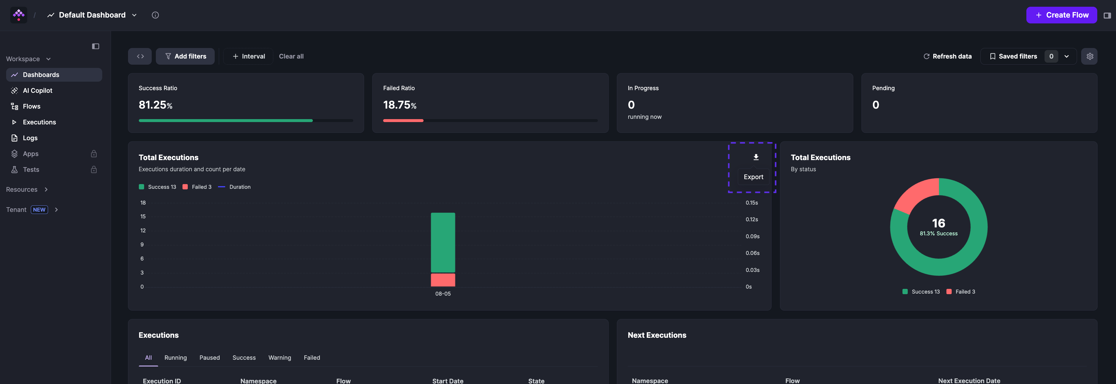
Export table data as CSV using the download icon in the top-right corner of a table chart — no pagination required.
Querying data
The data property of a chart defines the type of data that is queried and displayed. The type determines which columns are available.
Data source types
Dashboards can query data from these source types:
| Type | Description |
|---|---|
io.kestra.plugin.core.dashboard.data.Executions | Workflow execution data |
io.kestra.plugin.core.dashboard.data.ExecutionsKPI | Execution data for KPI charts (supports numerator) |
io.kestra.plugin.core.dashboard.data.Flows | Flow definition data |
io.kestra.plugin.core.dashboard.data.FlowsKPI | Flow data for KPI charts (supports numerator) |
io.kestra.plugin.core.dashboard.data.Logs | Log entries produced by your workflows |
io.kestra.plugin.core.dashboard.data.LogsKPI | Log data for KPI charts (supports numerator) |
io.kestra.plugin.core.dashboard.data.Metrics | Metrics emitted by your plugins |
io.kestra.plugin.core.dashboard.data.MetricsKPI | Metrics data for KPI charts (supports numerator) |
io.kestra.plugin.core.dashboard.data.Triggers | Trigger state and scheduling data |
io.kestra.plugin.ee.dashboard.data.Assets | Asset inventory data (EE and Cloud only). Not filtered by the dashboard time range — charts always reflect the current inventory. |
Available fields by data source
After defining the data source, specify the columns to display in the chart. Each column is defined by its field. The fields available depend on the data source type:
Executions / ExecutionsKPI:
| Field | Description |
|---|---|
ID | Execution ID |
NAMESPACE | Namespace of the flow |
FLOW_ID | Flow identifier |
FLOW_REVISION | Flow revision number |
STATE | Execution state (e.g., SUCCESS, FAILED) |
DURATION | Execution duration |
LABELS | Key-value labels attached to the execution |
START_DATE | Execution start timestamp |
END_DATE | Execution end timestamp |
TRIGGER_EXECUTION_ID | ID of the execution that triggered this one |
SCOPE | Execution scope |
Flows / FlowsKPI:
| Field | Description |
|---|---|
ID | Flow identifier |
NAMESPACE | Namespace of the flow |
REVISION | Flow revision number |
Logs / LogsKPI:
| Field | Description |
|---|---|
NAMESPACE | Namespace of the flow |
FLOW_ID | Flow identifier |
EXECUTION_ID | Associated execution ID |
TASK_ID | Task that produced the log |
DATE | Log timestamp |
TASK_RUN_ID | Task run identifier |
ATTEMPT_NUMBER | Task attempt number |
TRIGGER_ID | Trigger identifier |
LEVEL | Log level (e.g., INFO, WARN, ERROR) |
MESSAGE | Log message text (cannot be aggregated) |
Metrics / MetricsKPI:
| Field | Description |
|---|---|
NAMESPACE | Namespace of the flow |
FLOW_ID | Flow identifier |
TASK_ID | Task that emitted the metric |
EXECUTION_ID | Associated execution ID |
TASK_RUN_ID | Task run identifier |
TYPE | Metric type |
NAME | Metric name |
VALUE | Metric value |
DATE | Metric timestamp |
Triggers:
| Field | Description |
|---|---|
ID | Trigger identifier |
NAMESPACE | Namespace of the flow |
FLOW_ID | Flow identifier |
TRIGGER_ID | Trigger identifier within the flow |
EXECUTION_ID | Last execution ID triggered |
NEXT_EXECUTION_DATE | Scheduled next execution date |
WORKER_ID | Worker handling the trigger |
Assets (EE and Cloud only)
| Field | Description |
|---|---|
ID | Asset identifier |
TYPE | Asset type (e.g., io.kestra.plugin.ee.assets.VM) |
NAMESPACE | Asset namespace |
DISPLAY_NAME | Asset display name |
METADATA | Asset metadata map. Use metadataKey in the column definition to group or filter by a specific metadata key. |
CREATED | Asset creation timestamp |
UPDATED | Asset last updated timestamp |
Asset charts are not filtered by the dashboard time range — they always reflect the current inventory. Assets is compatible with Bar, Pie, and Table chart types. Use NAMESPACE in a where clause to scope results to a specific namespace.
Column properties
Each entry in data.columns supports the following properties:
| Property | Description |
|---|---|
field | Required. The field from the data source to display. |
displayName | Sets the label displayed in the chart |
agg | Aggregation function: AVG, COUNT, MAX, MIN, or SUM |
graphStyle | Series render style for TimeSeries charts: LINES, BARS, or POINTS (defaults to LINES when agg is set) |
columnAlignment | Column text alignment for Table charts: LEFT, RIGHT, or CENTER |
labelKey | When field: LABELS, filters to a specific label key |
Filtering data
Use the where property to filter the result set before it is displayed. Filters can apply to any field in the data source. Multiple conditions in where are combined with AND by default. To use OR logic, set type: OR on a condition.
Available filter types:
CONTAINSENDS_WITHEQUAL_TOGREATER_THANGREATER_THAN_OR_EQUAL_TOINIS_FALSEIS_NOT_NULLIS_NULLIS_TRUELESS_THANLESS_THAN_OR_EQUAL_TONOT_EQUAL_TONOT_INORPREFIXREGEXSTARTS_WITH
Was this page helpful?